The following table shows the functionality of all the buttons in the toolbar:
|
1 |
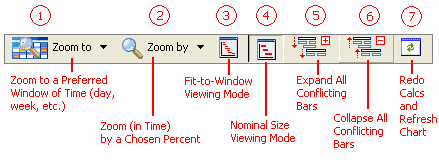
Allows the user to focus on a specific time span (an hour, a day, etc.). Once the choice is made, the zooming factor is adjusted so that the entire span of the window displays exactly the selected time span. Active only if the viewing mode is set to ‘Nominal’. |
|
2 |
Changes the zoom-in/out percentage thereby allowing you to either see more of the chart in a single window length, or focus in a more narrow width of time. Active only if the viewing mode is set to ‘Nominal’. |
|
3 |
‘Fit-to-Window’ viewing mode: In this mode, the chart is drawn in such a scale that the entire width of the chart fits in the available window space. As you increase the size of the chart’s window the chart is redrawn to adjust but always showing the entire contents in one window length (no horizontal scrolling necessary). Depending on the amount of information included in the chart, and the choices made for minor and major time increments, not all increments may show (some may be skipped) |
|
4 |
‘Nominal’ viewing mode. In this mode, the chart is drawn in a scale that fits perfectly the chosen minor time scale (and not bigger). In other words, in this mode, the application will make best use of available space to display comfortably all minor scale increments without skipping any. |
|
5 |
Equipment Occupancy Charts only. If there are any conflicts (overalps) in equipment, then this button shows as active. It will show all conflicts in equipment occupancy on separate lines (i.e., it will expand the overlapping bars) so that they can be clearly viewed by the user. |
|
6 |
Equipment Occupancy Charts only. If there are any conflicts (overalps) in equipment, then this button shows as active. It will collapse all conflicts in equipment occupancy currently shown in separate lines so that they hidden away. |
|
7 |
Operation Gantt Chart, Equipment Gantt Chart and Equipment Occupancy Charts only. If any modifications have been made to the underlying data, clicking on this button will redo the M&E balances, scheduling calculations and redraw the contents of the chart to reflect any changes. |
|
8 |
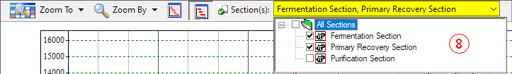
Resource Input or Output Charts only. From this drop down the user can select to view the resource demand or output of resources for specific sections in the process. The drop-down box displays ‘All Sections’ if all sections are selected, or a comma separated string of the selected section names. |